What makes medical website layout design actually convert?
Medical website layout design shapes every patient decision. A confusing layout drives visitors away quickly. A clear, thoughtful layout builds trust instantly. This guide breaks down what actually works.
You will learn about clinic website design elements that convert. We also cover healthcare UX design principles clearly. Real medical website examples guide the advice throughout.
What Is Medical Website Layout Design?
Medical website layout design arranges content for patient clarity. It combines visual hierarchy, navigation, and trust signals. Good layout guides visitors toward booking an appointment.
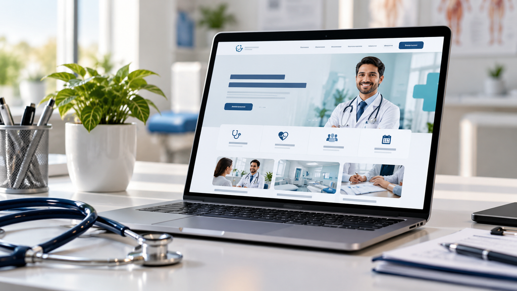
This differs from generic web design in key ways. Healthcare visitors often feel anxious or uncertain already. Layout must reduce friction and build confidence quickly.
Why Layout Design Matters for Clinic Websites
Patients decide within seconds whether to trust a site. Cluttered layouts damage that first impression instantly. Clean design signals professionalism and genuine care. Strong layout also directly supports conversion rates. Our conversion rate optimization service focuses heavily on this connection.
Layout affects more than looks alone. It influences how patients navigate, trust, and book visits.
Core Elements of Medical Website Layout Design
Several elements appear across high converting clinic sites. Understanding each one helps you plan your own layout.
Patients should find key pages within two clicks. Group services, doctors, and contact details logically. Confusing menus frustrate visitors before they explore.
Above the Fold Booking Access
Place your booking option near the very top. Visitors should never scroll far to book. This one decision often drives major conversion gains.
Trust Signals Near the Top
Certifications, reviews, and doctor credentials build immediate trust. Place these signals where visitors see them first. Late trust signals lose cautious visitors.
Treatment Pages That Convert Visitors
Treatment pages need clear, specific, benefit focused content. Explain what the treatment involves and who needs it. Avoid vague descriptions that fail to inform. Include a clear call to action on every page. Visitors reading about a treatment are often ready. Do not make them hunt for booking options.
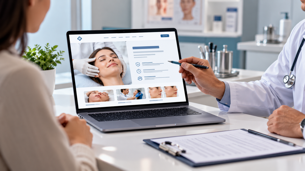
Our content writing services team writes treatment pages that inform and convert together.
Structuring a Strong Treatment Page
Start with a plain language summary of the treatment. Follow with benefits, process steps, and recovery details. End with pricing guidance and a booking button.
Add a short FAQ block near the bottom. This answers common worries before patients call. It also supports search visibility for question queries.
Testimonials and Social Proof Placement
Testimonials work best near key decision points. Show them beside treatment details or booking forms. This timing reinforces trust exactly when needed. Use specific, detailed testimonials over generic praise. Specific stories feel more credible and relatable. Our responding to reviews guide covers related reputation strategies.
Always respect patient privacy when sharing feedback. Get clear consent before publishing any names or photos.
Booking Widgets and Appointment Flow
Booking widgets should need minimal steps to complete. Every extra field risks losing a hesitant visitor. Keep required information limited to essentials. Confirm bookings immediately with clear, reassuring messages. Uncertainty after booking creates patient anxiety. A smooth flow reflects well on your practice. Offer a phone number beside the widget too. Some patients still prefer to speak with someone. Options improve conversions across different visitor types.
Clinic Website Design for Mobile Visitors
Most patients now browse clinic websites on mobile. Our mobile first indexing guide explains why this matters for rankings too.
Buttons should stay large and easy to tap. Forms should stay short and simple on small screens. Test your booking flow across devices regularly.
Healthcare UX Design Principles to Follow
Healthcare UX design prioritizes clarity over cleverness. Patients want quick answers, not creative confusion. Simple, predictable patterns work best for this audience. According to Nielsen Norman Group’s healthcare research, anxious users need extra reassurance. Clear labels and simple language help significantly.

Reduce cognitive load wherever possible. Fewer choices per page usually improve completion rates.
Medical Website Examples Worth Studying
Studying strong medical website examples reveals consistent patterns. Look for clear hierarchy and obvious booking paths. Notice how trust signals appear early and often. Compare examples across specialties and clinic sizes. Dental, hospital, and therapy sites often differ slightly. Adapt the lessons to fit your practice.
Our local SEO for dentists guide shows how specialty sites attract nearby patients.
Color and Typography in Medical Website Layout Design
Color choices influence patient perception more than expected. Calming blues and greens often suit healthcare well. Avoid harsh, alarming colors in medical contexts. Typography should prioritize readability over decoration. Larger font sizes help older or anxious visitors. Consistent heading hierarchy also supports easier scanning.
Homepage Layout Best Practices for Clinics
Your homepage should answer three questions immediately. What services do you offer? Who are you? How do visitors book? Feature your most requested services near the top. Push less common services further down the page. This order matches real visitor demand.
About and Doctor Bio Pages
Doctor bio pages build essential trust with new patients. Include credentials, experience, and a genuine personal touch. Overly formal bios sometimes feel cold and distant. Photos matter on these pages too. Professional, approachable photos humanize your practice. Avoid stock photography whenever genuine images are possible.
Contact and Location Page Design
Contact pages need more than a simple form. Include maps, hours, and multiple contact methods clearly. Our local SEO for doctors guide explains why this consistency matters. Match your details with your Google Business Profile. Our Google Business Profile guide explains this connection further.
Common Layout Mistakes That Hurt Conversions
Overcrowded pages overwhelm visitors and hide key actions. Too many competing calls to action confuse decisions. Simplify each page around one clear goal. Slow pages also hurt conversions quietly. Review our site speed optimization guide for practical fixes. Outdated design signals neglect to cautious healthcare visitors. Regular refreshes maintain ongoing patient trust.
SEO Considerations Within Medical Website Layout Design
Layout and SEO should work together, not separately. Clear heading structure supports users and search engines. Our keyword research guide helps shape page content.

Image alt text matters within medical layouts too. Our alt text on image guide explains best practices clearly. Our SEO for hospitals guide covers broader healthcare content standards.
Accessibility in Healthcare Website Layout
Accessible design serves every visitor, including those with disabilities. According to W3C’s accessibility introduction, clear structure benefits all users. This includes screen reader support and color contrast. Keep buttons and links keyboard friendly throughout. Accessibility often improves overall usability too.
Measuring Whether Your Layout Converts
Track booking completion rates across your site. Our analytics and reporting dashboards guide explains how to build this tracking. Watch which pages have high exits before booking. These pages often reveal specific layout problems. Regular SEO audits can uncover related technical issues.
Building a Complete Clinic Website Strategy
Layout works best alongside strong content and SEO. Our website design services team builds this integrated approach for clients. According to Baymard Institute’s usability research, small layout changes often improve conversions. Testing remains essential for continuous improvement.
Combine strong layout with SEO services for lasting clinic growth. Explore our blog for more healthcare design guidance.
Custom Development Versus Website Builders
Some clinics start with simple builder templates. These work for very small practices initially. Growing clinics often need more flexible solutions. Our custom website development team builds layouts tailored to practice needs. Our WordPress website development service offers a flexible middle ground.
Technical Foundations for a Fast Clinic Website
Layout choices affect loading speed directly. Heavy images and scripts slow pages down. Our core web vitals optimization guide covers key fixes. According to Google’s web.dev vitals guide, faster pages improve visitor engagement. Review our technical SEO audit checklist before launching any redesign. This catches hidden problems early.
Schema and Search Visibility for Clinic Pages
According to Google’s structured data guide, markup helps search engines understand pages. It can improve how listings appear in results.
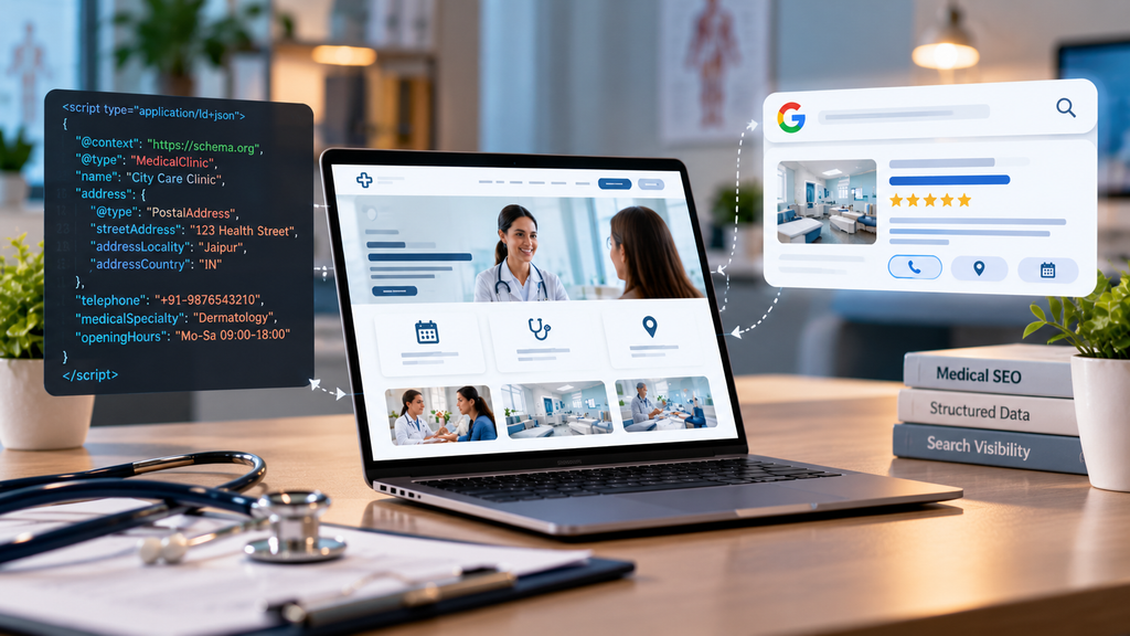
Our schema markup guide explains the setup clearly. Clear page titles and descriptions also help. Our meta description guide covers writing effective summaries.
Marketing Channels That Feed Your Clinic Layout
Great layout needs visitors to work with. Strong local SEO brings nearby patients to your pages. Paid and social channels add further reach. Our Google Ads management services can send targeted patients to treatment pages. Send them to pages built to convert. Our digital marketing strategies guide shows how these channels fit together.
Mapping the Patient Journey Within Clinic Website Design
Every visitor moves through stages before booking. They notice a problem, research options, and then decide. Your layout should support each stage clearly. Our marketing funnel guide explains these stages in detail. Map each page to one stage of that journey. Early stage visitors want education and reassurance. Late stage visitors want pricing, availability, and easy booking. Serve both groups without cluttering any single page.
Pricing and Insurance Information Layout
Cost worries stop many patients from booking. Address pricing openly wherever your policy allows. Even ranges and payment options reduce uncertainty.
List accepted insurance providers on a dedicated page. Link to it from treatment pages and the footer. Clear answers here prevent unnecessary phone calls.
Educational Content and Blog Placement
Helpful articles build trust before patients ever book. Place a small resource section on your homepage. Link relevant guides from related treatment pages. Strong educational content also supports organic search visibility. It brings in patients researching symptoms and options. Always have a qualified clinician review medical content. Accuracy protects both patients and your reputation.
Call, Chat, and WhatsApp Buttons
Quick contact options help patients with urgent questions. A sticky call button works well on mobile. Chat widgets can answer simple questions instantly.
Many Indian patients prefer messaging over phone calls. Our WhatsApp marketing service supports this preference. Keep these buttons visible but not intrusive.
Footers act as a safety net for lost visitors. Include contact details, hours, and key page links. Add your address and a small map link.
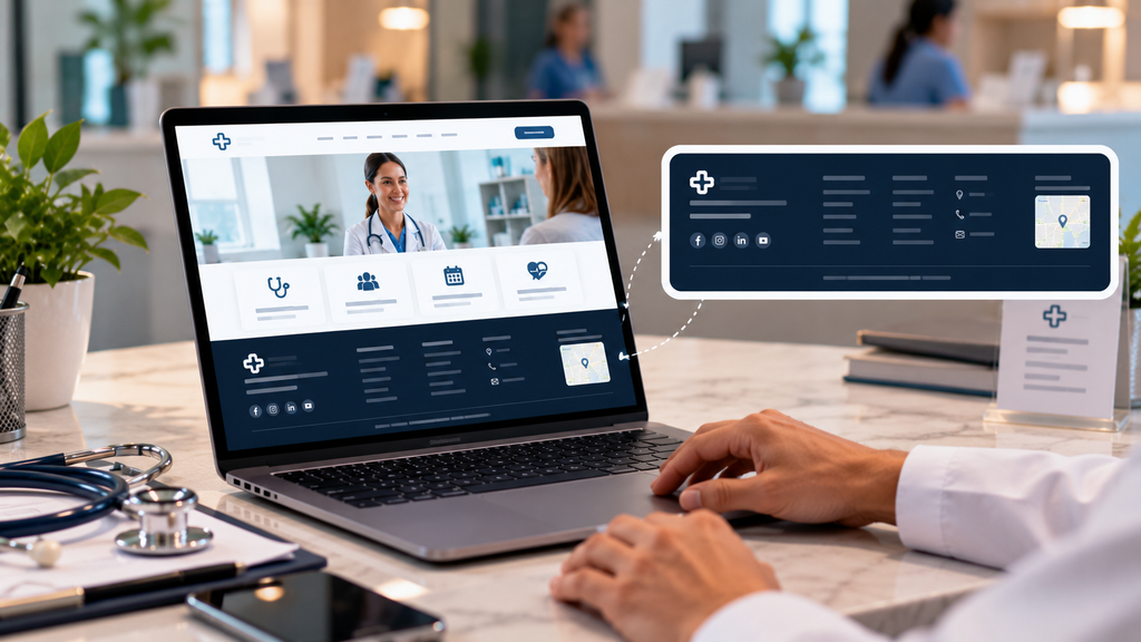
Repeat your booking call to action here too. Visitors who scroll far still deserve an easy next step.
Layout for Multi Location Clinics
Clinics with several branches need clear location pages. Each branch deserves its own address, hours, and team details. Avoid squeezing every location onto one page.
Our multi location SEO guide explains how to structure these pages. Consistent layouts across branches build brand trust.
Layout Testing and Continuous Improvement
Never assume your layout works without evidence. Test button colors, headlines, and form lengths systematically. Change one element at a time.
Heatmaps show where visitors click and stop. Session recordings reveal confusing moments in real journeys. Use these insights to guide each new test.
Document every test and its result. This history prevents repeating failed ideas later.
AI Search and Clinic Website Layout
Patients now ask AI tools about local clinics. Clear, structured pages help these tools understand your services. Understanding what is AI SEO helps you prepare.
Our AI SEO services help clinics adapt pages for these new formats. Concise answers near the top of pages perform well.
Images and Video in Clinic Layouts
Real photos of your team and space build trust. Patients want to see where they will visit. Avoid generic stock images wherever possible. Short intro videos from doctors can calm anxious patients. Keep them brief and place them beside key pages. Compress files so pages still load quickly. Describe every image with clear alt text. Our image alt text guide shows how.
Privacy and Security Cues for Patients
Patients share sensitive details through online forms. Show clear privacy notes beside every form. Use secure connections across the entire site.

Explain briefly how you protect patient information. Short, plain language works better than legal jargon. These cues quietly increase form completion.
Urgent Care and Emergency Information
Some visitors need help right now. Make emergency guidance visible without cluttering the page. A clear line about urgent situations protects patients.
Display after hours contact options where relevant. Clear expectations reduce frustration and support patient safety.
Layout Reviews and Ongoing Support
Layouts need regular care after launch. Schedule quarterly reviews of key pages and forms. Fix broken links and outdated details promptly.
Our local SEO services team supports clinics beyond the initial design. Ongoing care keeps visibility and conversions steady.
Keeping Your Layout Fresh Over Time
Design trends and patient expectations shift over time. Review your layout annually for outdated elements. Small, regular updates prevent costly full redesigns.
Gather patient feedback about your website experience. This feedback often reveals issues internal teams miss.
Frequently Asked Questions
Great layouts combine clear navigation, visible booking options, and trust signals. They reduce visitor confusion while guiding patients toward scheduling appointments. Simplicity and clarity matter more than decorative complexity overall.
Clinic website design shapes first impressions within just seconds of arrival. Clean, professional layouts signal competence and genuine clinical care. Cluttered or outdated designs can quickly damage patient confidence instead.
Healthcare UX design focuses on reducing confusion for often anxious visitors. It prioritizes clear labeling, simple navigation, and minimal required steps. This approach improves user satisfaction and booking conversion rates.
Testimonials work best placed near treatment details or booking forms directly. This positioning reinforces trust exactly when patients are deciding. Specific, detailed stories generally perform better than generic praise alone.
Clinics should review their website layout at least once yearly. Small, regular updates prevent the need for costly full redesigns. Patient feedback and analytics data should guide these ongoing improvements.
Conclusion
Strong medical website layout design turns visitors into patients. Clear navigation, visible booking, and trust signals all matter. Every element should reduce friction and build confidence. Thoughtful clinic website design reflects the quality of your care. Apply healthcare UX design principles throughout every page. Study medical website examples to guide your own decisions.
Great layout compounds alongside strong content and SEO. Explore our complete SEO services to help your clinic convert more visitors.

About the author
Ujjwal Kumawat
I specialize in SEO, website development, Google Ads and online business growth strategies. Through my blogs, I share practical insights, marketing tips and proven strategies to help businesses improve their online visibility, generate more leads and grow faster in the digital space.