Is your website being judged by how it looks on a phone? If you have not fully optimised for mobile-first indexing, Google may already be ranking your competitors above you, even if your desktop site looks perfect.
This guide breaks down everything you need to know about mobile-first indexing SEO, how Google crawls and evaluates your mobile pages, and exactly what steps you need to take right now to protect and grow your rankings.
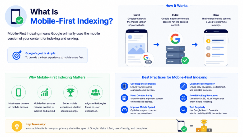
What Is Mobile-First Indexing?
Mobile-first indexing means Google predominantly uses the mobile version of your website’s content for crawling, indexing, and ranking in search results. Instead of evaluating your desktop pages as the primary source, Googlebot Smartphone crawls your mobile pages first and uses what it finds there to determine your position across all search results, including desktop searches.
Google completed its full transition to mobile-first indexing in mid-2024. As of 2026, every single website on the web is indexed mobile-first without exception. There is no opt-out, no workaround, and no separate desktop-first index to fall back on. Your mobile version is your ranking version.
This is not simply about making your website look good on a small screen. Mobile-first indexing determines whether your content gets indexed at all, whether your structured data reaches Google, whether your internal links pass authority, and ultimately whether your pages rank for the keywords your business depends on. Businesses that treat mobile as a secondary experience directly damage their SEO services performance without realising it.
Why Google Switched to Mobile-First Indexing
Google’s switch to mobile-first indexing was driven by a fundamental shift in how people use the internet. Mobile devices now account for over 63% of all global web traffic as of early 2026. For local, retail, and consumer-facing searches, that figure exceeds 75%. By continuing to rank pages based on desktop versions, Google was evaluating content through a lens that the majority of its users never saw.
The transition began in 2016 when Google first announced mobile-first indexing experiments. By 2021, it became the default for all new sites. By October 2023, the full migration covered all existing websites. It mid-2024, Google completed the switch entirely.
AI-powered search systems, including Google’s AI Overviews and third-party LLM crawlers, primarily retrieve content from fast, accessible mobile interfaces. Websites that deliver a poor mobile experience lose visibility in both traditional organic results and the growing AI search channel. If your AI SEO strategy does not account for mobile-first indexing, you are leaving a significant portion of your potential traffic unclaimed.
How Mobile-First Indexing Works in 2026
When Googlebot crawls your website, it sends requests using the Googlebot Smartphone user agent, simulating a mobile browser at approximately 411 pixels wide. What it finds in the mobile HTML response is what enters Google’s index. The desktop version of your site becomes a secondary reference that Google largely ignores for ranking purposes.
Google’s rendering process follows the same three-phase approach used for all pages: crawling the raw HTML, rendering JavaScript in a headless Chromium browser, and then indexing the processed output. However, every stage uses mobile parameters, not desktop. Any content, link, structured data, or directive that only exists in your desktop rendering simply does not exist for Google.
Googlebot does not click, scroll, or interact with the mobile page during rendering. Content hidden behind JavaScript interactions, accordion clicks, or scroll triggers may not reach Google’s index. This directly connects to broader technical SEO for website performance principles that demand critical content stays in the initial HTML response.
How Mobile-First Indexing Affects Your SEO
Mobile-first indexing touches every major SEO discipline.
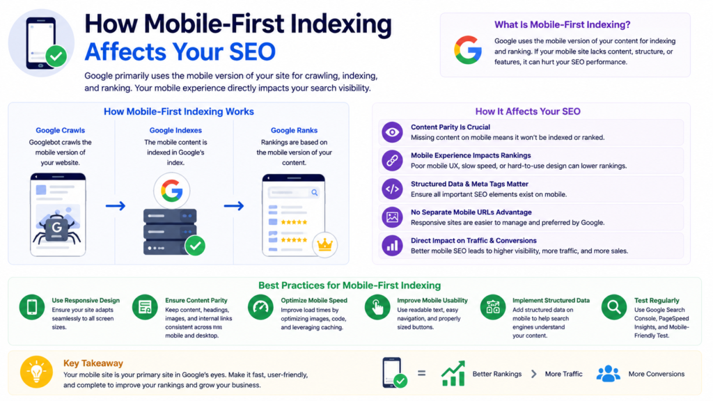
Rankings across all devices. Your mobile page quality now determines your position in both mobile and desktop search results. A developer who hides comparison tables or product filters on mobile to save screen space can trigger a ranking drop overnight. Google evaluates what the mobile version contains and ranks accordingly for every device.
Content indexation. Any text, heading, product description, or FAQ answer that your mobile version omits will not be indexed. If your mobile site strips content to improve load speed without considering SEO consequences, you directly reduce the keywords your pages can rank for.
Internal linking and crawl efficiency. If your mobile navigation excludes links that appear in your desktop header or footer, Google cannot discover and crawl those destination pages as efficiently. For large eCommerce SEO websites with deep category structures, this creates meaningful gaps in crawl coverage.
Structured data and rich results. Google reads structured data from your mobile pages. If your product schema, FAQ schema, or breadcrumb schema only exists in desktop templates, Google cannot generate rich results for those pages. Rich results on mobile SERPs can deliver click-through rate improvements of 20 to 40 percent compared to plain links.
AI search visibility. AI crawlers powering generative search engines primarily read fast, accessible mobile HTML. Websites with slow or content-thin mobile pages lose visibility in AI-generated answers, cutting off a fast-growing traffic channel that complements your broader digital marketing strategies.
Responsive Design and Mobile-First Indexing
Responsive design is the optimal mobile configuration for mobile-first indexing. It serves the same HTML on the same URL regardless of device, using CSS media queries to adapt the visual layout. Googlebot always finds identical content, identical links, identical structured data, and identical metadata whether it crawls using a smartphone or desktop user agent.
The alternatives, separate mobile URLs and dynamic serving, both introduce complexity and risk under mobile-first indexing. Separate mobile URLs require careful canonical and alternate tag management. Dynamic serving risks serving incorrect content if user agent detection fails.
For any new custom website development project, responsive design is the correct default. If you currently run a legacy separate mobile site, migrating to responsive design should rank as a priority in your next SEO audit. Consolidating link equity to a single URL and eliminating content parity risks make responsive design the most technically sound foundation available.
Content Parity: The Most Critical Requirement
Content parity means the mobile version of your page contains the same content as the desktop version. This is the single most important requirement under mobile-first indexing, and it is where the majority of ranking losses originate.
Common content parity failures include hiding product descriptions on mobile to reduce page length, moving detailed content into JavaScript-dependent tabs that do not render server-side, removing breadcrumbs or footer links from mobile templates, and using different heading structures that omit keywords present in the desktop version.
Google’s official documentation states clearly that if your mobile site has less content than your desktop site, you can expect traffic loss. Rather than removing content, move secondary content into accordions or tabs so it remains in the HTML while staying visually compact. This principle extends to metadata: your mobile pages must carry the same title tags, canonical tags, hreflang annotations, and robots meta tags as their desktop counterparts. Your schema markup implementation must be verified on mobile templates specifically.
Technical SEO Checklist for Mobile-First Indexing
Viewport configuration. Every page must include a correctly configured viewport meta tag: <meta name="viewport" content="width=device-width, initial-scale=1">. Pages without this tag trigger mobile usability errors in Google Search Console.
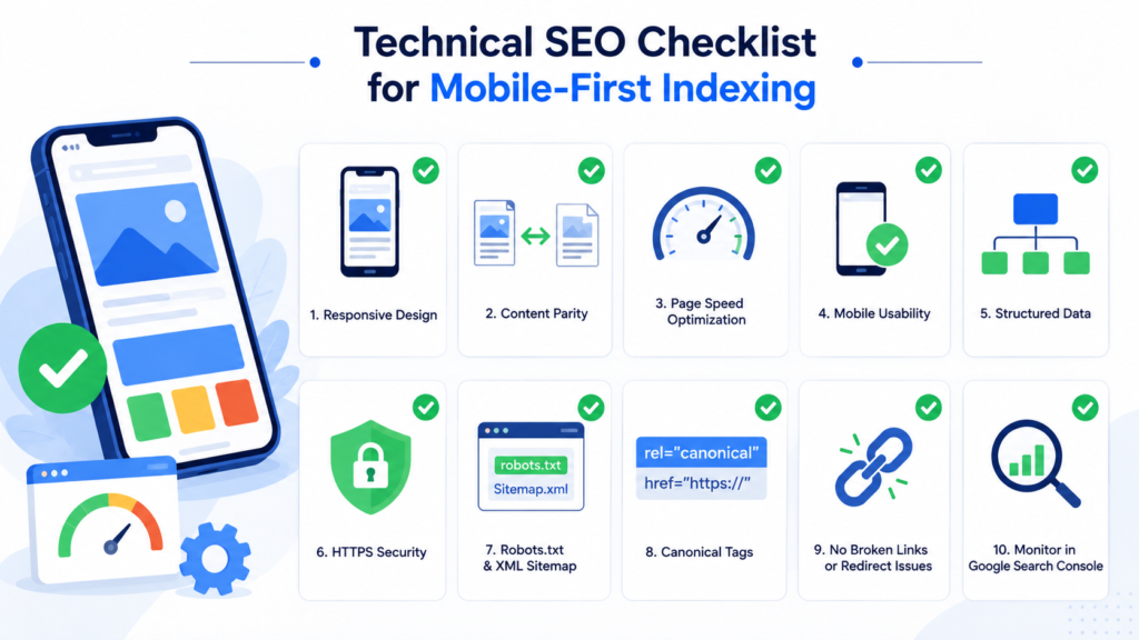
JavaScript resources. Do not block JavaScript or CSS files in robots.txt. Googlebot must access these files to render your mobile pages correctly. Blocking JS resources prevents Google from seeing content those scripts generate.
Page speed on mobile. Google measures Largest Contentful Paint on mobile devices over simulated 4G connections. Investing in site speed optimisation directly improves mobile-first indexing performance and Core Web Vitals scores simultaneously.
Touch targets and usability. Tap targets smaller than 48×48 pixels, font sizes below 16px requiring zoom, and horizontal scrolling all generate mobile usability errors in Google Search Console and affect page experience signals.
Image optimisation. Use supported image formats, provide consistent alt text across both mobile and desktop, and avoid dynamically changing image URLs that prevent Google from caching and indexing images correctly.
Internal links in mobile HTML. Confirm your mobile navigation, breadcrumbs, and footer links are present in the raw HTML response, not injected by JavaScript after page load. This is a standard item in any technical SEO audit checklist.
Core Web Vitals and Mobile-First Indexing
Core Web Vitals are Google’s primary performance ranking signals, and Google measures them on mobile devices. It optimisation is inseparable from mobile-first indexing success.
Largest Contentful Paint (LCP) must fall under 2.5 seconds on a 4G mobile connection. Heavy hero images, render-blocking JavaScript, and slow server response times are the most common causes of poor mobile LCP. A dedicated Core Web Vitals optimisation guide addresses each root cause systematically.
Interaction to Next Paint (INP) measures how quickly the page responds to taps and swipes. Mobile devices have slower CPUs than desktops. JavaScript that parses in 200 milliseconds on a desktop may take 800 milliseconds on a mid-range Android phone. Reducing JavaScript bundle sizes through code splitting directly improves mobile INP scores.
Cumulative Layout Shift (CLS) measures visual stability. Ads and dynamically loaded content injected above existing page elements after load cause layout shifts. Setting explicit dimensions on images and reserving space for dynamic content prevents CLS issues.
Poor Core Web Vitals scores on mobile suppress rankings across desktop results as well, because Google’s unified index draws from mobile performance data.
Mobile-First Indexing for eCommerce Websites
eCommerce websites face a concentrated set of mobile-first indexing challenges that compound across thousands of pages simultaneously.

Product pages with JavaScript-rendered specifications, pricing, and availability create indexing delays across the entire catalogue. Faceted navigation and filter systems that generate URLs dynamically but only in client-side rendered HTML create double barriers: Google struggles to discover the URLs and struggles to index their content.
Mobile navigation on eCommerce sites often strips category links to save screen space, removing the internal linking structure that communicates site architecture to Google. Breadcrumb navigation, which is critical for eCommerce development SEO because it links deep category hierarchies, must be present in the mobile HTML to contribute link equity.
Conversion rate optimisation for eCommerce aligns directly with mobile-first indexing requirements. Faster mobile load times, cleaner navigation, and better content parity all improve both Google’s evaluation of your pages and the experience that drives users to purchase.
How to Test Mobile-First Indexing
Google Search Console URL Inspection Tool. Enter any URL to see exactly what Googlebot rendered using the smartphone user agent, including blocked resources, the selected canonical URL, and any indexing errors. Run the live test for recently updated pages to verify changes have been processed.
Google Search Console Mobile Usability Report. This report surfaces pages with viewport errors, touch target issues, font size problems, and content width violations. Address every flagged issue as a priority.
PageSpeed Insights. Always run with the mobile toggle active. The lab simulation uses a Moto G Power on throttled 4G, which represents realistic conditions for a large portion of your audience.
View Source vs Inspect comparison. Right-click any page and select View Page Source to see raw HTML. Then select Inspect to see the rendered DOM. Content present in Inspect but absent from View Page Source exists only in the rendered DOM and is subject to indexing delays.
Common Mobile-First Indexing Mistakes to Avoid
Hiding content on mobile to improve load speed. Removing text or specifications from mobile pages directly reduces the keyword coverage Google can assign to those pages.
Using different robots meta tags on mobile. A noindex tag on mobile that does not exist on desktop removes those pages from Google’s index entirely across all devices.
Blocking JavaScript or CSS in robots.txt. This prevents Googlebot from rendering your mobile pages correctly, making JavaScript-generated content invisible to Google.
Relying on JavaScript-only internal links. Links using onclick handlers rather than standard anchor tags with href attributes do not reliably pass link equity. Use standard anchor tags for all navigational links.
Ignoring structured data on mobile templates. Schema markup that only exists in desktop templates will not generate rich results, because Google reads structured data from mobile pages under mobile-first indexing.
Frequently Asked Questions
Mobile-first indexing means Google uses your website’s mobile version as the primary source for crawling, indexing, and ranking. Since 2024, every site is indexed this way. Poor mobile pages hurt rankings across all devices, directly impacting your SEO services performance.
Implement responsive design, ensure full content parity between mobile and desktop, resolve Core Web Vitals issues, and monitor Google Search Console regularly. For faster results, work with specialists in local SEO services or technical SEO to audit and fix mobile gaps systematically.
Mobile-first indexing means Google’s unified index draws entirely from your mobile pages. Any content, structured data, or internal links missing from your mobile version will not influence rankings. Desktop-only SEO improvements, including schema markup changes, will not improve rankings unless replicated on mobile.
Yes, directly. Google’s unified index draws from mobile page data, so slow mobile load times, thin mobile content, or missing structured data suppress desktop rankings too. Strong site speed optimisation on mobile protects your rankings across every device and search result type.
Use Google Search Console’s Mobile Usability Report and URL Inspection Tool to identify rendering and usability errors. Run PageSpeed Insights on mobile toggle. A structured technical SEO audit checklist helps catch content parity gaps, blocked resources, and Core Web Vitals failures before they affect rankings.
Conclusion: Making Mobile-First Indexing Work for Your Rankings
Mobile-first indexing is not a future consideration or an optional optimisation layer. It is the permanent foundation of how Google evaluates every website in 2026. Your mobile version is your ranking version, full stop.
The businesses that rank consistently under mobile-first indexing have made deliberate technical decisions: implementing responsive design, maintaining complete content parity between mobile and desktop, passing Core Web Vitals thresholds on mobile, and continuously auditing their mobile pages through Google Search Console.
If you are unsure whether your site meets mobile-first indexing standards, a structured technical SEO audit is the right starting point. Whether you need a full website design services overhaul or targeted technical fixes, addressing mobile-first indexing now protects every ranking your business has already earned.

About the author
Ujjwal Kumawat
I specialize in SEO, website development, Google Ads and online business growth strategies. Through my blogs, I share practical insights, marketing tips and proven strategies to help businesses improve their online visibility, generate more leads and grow faster in the digital space.