Is your website ready for mobile first indexing or are you silently losing Google rankings?
Mobile first indexing means Google uses your mobile site version to determine all rankings. This applies to desktop searches too, not only mobile searches. If your mobile version is weak, your entire site ranks lower across every device. This guide explains what mobile first indexing is, how it affects SEO, and the exact steps to protect your visibility.
For brands building digital marketing strategies, mobile-first readiness is now a baseline technical SEO requirement affecting every page on every device.
What Is Mobile First Indexing
This is the direct answer most readers want immediately here. Mobile first indexing means Google crawls and indexes your mobile site version first. That mobile version determines your rankings across all search results.

According to Google’s official mobile-first indexing documentation, Google predominantly uses the mobile version of content for indexing and ranking. The desktop version is only used as a fallback when no mobile version exists.
Google completed the migration of all websites to mobile-first indexing by October 2023. Every website is now evaluated under this standard without exception.
Google Mobile First Indexing: Why This Shift Happened
Understanding why Google made this change explains why it matters so deeply for rankings.
According to Google’s mobile-first indexing history, the switch began in 2018 following the global shift in search behaviour. Mobile searches had surpassed desktop searches globally, making desktop-first indexing an increasingly poor reflection of actual user behaviour.
The logic is straightforward. If most users search on mobile, Google should evaluate content quality from the mobile perspective. Content that renders poorly on mobile was failing the majority of actual users regardless of how well it appeared on desktop.
According to Statista’s global mobile traffic research, mobile devices now account for approximately 60 percent of all global website traffic. In markets like India, that percentage is significantly higher.
This context makes mobile-first indexing not just a Google policy but a user reality that websites must address regardless of its algorithmic impact.
How Mobile First Indexing Works Technically
Understanding the technical mechanism helps you audit your site correctly.
Google uses two different user agents for crawling: a desktop Googlebot and a smartphone Googlebot. Under mobile-first indexing, the smartphone Googlebot is the primary crawler that determines indexing and ranking decisions.
When Googlebot smartphone visits your website, it sees whatever your mobile users see. If your mobile version hides content that your desktop version shows, Google only indexes the mobile-visible content. Hidden mobile content does not receive ranking credit even if it appears prominently on desktop.
This creates several specific vulnerabilities that technical audits must address. Our technical SEO audit checklist covers mobile-first indexing checks as a dedicated audit category.
Mobile First Indexing SEO: Key Ranking Impacts
Mobile first indexing SEO impacts fall into four critical areas every website owner must address.
Content Parity Between Mobile and Desktop
Content that exists only on desktop will not be indexed under mobile-first indexing. This was the single most significant initial impact when mobile-first indexing rolled out.

Review your mobile version for these common content parity failures:
Accordion sections that collapse content on mobile but show it expanded on desktop.
Tabs that hide content from mobile display to save space.
Images loaded only on desktop for bandwidth reasons.
Product descriptions or specifications shown on desktop but hidden or truncated on mobile.
Text content rendered through JavaScript that fails to load on mobile devices.
Our JavaScript SEO guide covers how JavaScript-rendered content interacts with mobile-first indexing specifically. Content that does not render server-side may be invisible to Google’s mobile crawler regardless of how it appears to users.
Metadata Consistency Across Versions
Title tags, meta descriptions, and structured data must be identical across your mobile and desktop versions.
If your mobile version carries different title tags or truncated meta descriptions compared to desktop, Google indexes the mobile metadata. Unintended differences between versions often create unexpected ranking changes.
Run a crawl of both your mobile and desktop versions using Screaming Frog and compare metadata across all pages. Any divergence requires immediate attention.
Image Optimisation for Mobile Crawling
Images that do not load correctly on mobile are not indexed by Google’s mobile crawler. Use standard HTML image tags rather than CSS background images for content-critical images.
Implement responsive images using the srcset attribute to serve appropriately sized images across different screen widths. Lazy loading images with the loading=”lazy” attribute improves mobile page speed while maintaining indexability.
Our image alt text guide explains how to implement alt text correctly on all images for both accessibility and mobile-first indexing compatibility.
Page Speed on Mobile
Mobile page speed is a direct ranking factor and a mobile-first indexing consideration simultaneously.
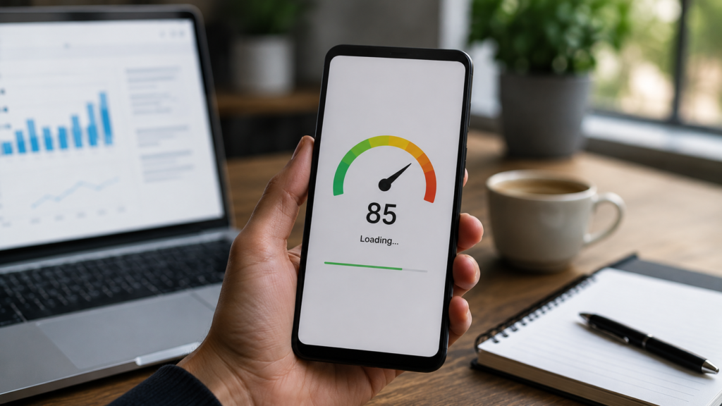
Pages that load slowly on mobile connections deliver poor user experiences that Google’s quality signals measure. According to Google’s Core Web Vitals documentation, pages failing Core Web Vitals thresholds on mobile are actively suppressed in rankings compared to passing competitors.
Our site speed optimisation guide covers every technical improvement that affects mobile loading performance and Core Web Vitals scores.
Mobile First Index vs Mobile Responsive vs Mobile Friendly
These three terms are often confused but represent distinct things with different implications.
Mobile-first index refers to Google’s indexing methodology. It is a Google process, not a website feature.
Mobile responsive refers to a website design approach. A responsive website serves the same HTML across all devices and uses CSS to adapt the layout for different screen widths. This is the recommended approach for mobile-first indexing compatibility.
Mobile friendly is a broader term describing websites that work acceptably on mobile devices. A website can be mobile friendly without being fully responsive, for example by using a separate m.dot subdomain for mobile users.
According to Google’s site configuration guidance, responsive design is the recommended configuration for mobile-first indexing. It avoids the content parity issues that separate mobile URLs create.
Checking Your Mobile First Indexing Status
You can confirm whether Google is crawling your site with its mobile or desktop crawler through Google Search Console.
In Google Search Console, navigate to Settings and then Crawling. This shows which Googlebot version Google uses to crawl your site. Since October 2023, all sites should show the smartphone Googlebot as the primary crawler.
You can also use the URL Inspection tool in Search Console. Enter any page URL and click Test Live URL. Select the rendering type to see how Google’s smartphone crawler renders your page. This view reveals exactly what Google sees on mobile.
For detailed mobile usability reports, check the Core Web Vitals report in Search Console. This shows mobile-specific performance data including which pages fail LCP, FID, and CLS thresholds on mobile devices.
Our how to perform an SEO audit guide includes mobile-first indexing verification as a standard step in the technical audit workflow.
Structured Data and Mobile First Indexing
Structured data markup must appear in your mobile version to be indexed under mobile-first indexing.
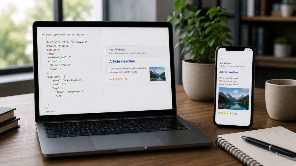
If structured data exists only in your desktop HTML but not in your mobile version, Google will not process it for search features like rich results. This can silently remove rich snippet appearances even when your schema implementation appears correct through desktop testing.
Test structured data specifically on your mobile version using Google’s Rich Results Test tool. Enter your URL and compare the schema output against what appears in your desktop test.
Our schema markup complete guide covers implementation best practices that ensure structured data appears correctly in both mobile and desktop versions simultaneously.
Internal Linking Under Mobile First Indexing
Internal links that appear only on desktop versions of pages are not crawled by Google’s smartphone Googlebot.
Navigation menus that collapse entirely on mobile, footer links hidden via CSS display:none, or sidebar links absent from mobile layouts all create invisible link structures from Google’s perspective. Pages accessible only through these desktop-only links may experience reduced crawl coverage.
Audit your mobile version specifically for navigation and internal link accessibility. Ensure all navigation elements and contextual internal links within content are fully accessible to mobile users and therefore visible to Google’s smartphone crawler.
Our canonical tags guide explains how canonicalisation interacts with mobile-first indexing for sites using separate mobile URLs or m-dot subdomains.
Mobile First Indexing for Ecommerce Sites
Ecommerce sites face specific mobile-first indexing challenges due to their complex product page structures and large catalogue sizes.
Product specifications, customer reviews, and detailed descriptions are commonly collapsed or paginated on mobile versions to improve perceived load speed. Under mobile-first indexing, this collapsed content receives no indexing credit regardless of its importance to ranking.
Ensure all product content, including full descriptions, specifications, and reviews, is accessible in the mobile version without interaction required. Infinite scroll and lazy-loaded review sections need special technical attention to ensure Google can discover and index all content.
Our eCommerce SEO service addresses mobile-first indexing as a foundational technical requirement for all product and category page optimisation work.
For stores built on Shopify, WooCommerce, or custom platforms, our eCommerce development service implements mobile-first technical architecture from the initial build phase.
Core Web Vitals and Mobile First Indexing
Core Web Vitals measurements under mobile-first indexing use real-world mobile user data primarily.
The three Core Web Vitals metrics measure Largest Contentful Paint (LCP), Interaction to Next Paint (INP), and Cumulative Layout Shift (CLS). Google’s Page Experience ranking signal applies these measurements predominantly from the perspective of mobile users.
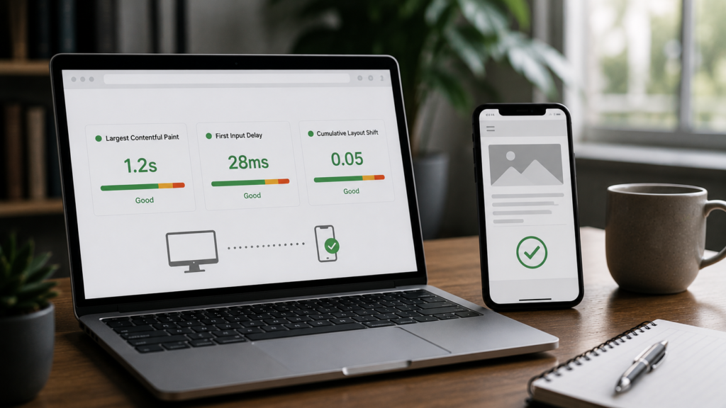
A website with excellent desktop Core Web Vitals scores can still suffer ranking penalties if mobile scores fail the thresholds Google applies. Mobile-specific issues like render-blocking resources, unoptimised images served at full resolution, and slow server response times are the most common causes of mobile Core Web Vitals failures.
Our Core Web Vitals optimisation guide covers every improvement that specifically addresses mobile Core Web Vitals performance alongside desktop score improvements.
Common Mobile First Indexing Mistakes to Avoid
These mistakes consistently suppress rankings under mobile-first indexing even when other SEO elements are strong.
Using disallow directives that block Googlebot smartphone. Check your robots.txt file and ensure resources needed by your mobile version are not inadvertently blocked. JavaScript files, CSS files, and image directories must all be crawlable.

Serving different content based on user agent detection. Cloaking content to show Googlebot a different version than mobile users see violates Google’s guidelines and may trigger manual penalties.
Hiding important content with CSS display:none on mobile. Google may not index content hidden with CSS, even when it appears in the HTML. Show all important content visibly on mobile or accept that it may not be indexed.
Not testing mobile rendering before publishing. Use Google Search Console’s URL Inspection mobile rendering view to confirm each important page renders correctly on mobile before it goes live.
Ignoring mobile page speed. Even excellent content and perfect structure cannot fully compensate for mobile page speeds that frustrate users before content loads.
According to Search Engine Land’s mobile-first indexing complete guide, consistently checking the mobile rendering view in Search Console for newly published pages catches most mobile-first indexing issues before they suppress rankings.
Frequently Asked Questions
It means Google uses your mobile site to decide your rankings everywhere. Desktop content that is absent from mobile is not indexed.
Yes, completely. Google uses the mobile version to determine rankings for both mobile and desktop search results simultaneously.
Check Google Search Console under Settings then Crawling. The smartphone Googlebot should show as your primary crawler since October 2023.
No, responsive design is the recommended approach. Separate mobile URLs create content parity risks that responsive design avoids entirely.
Can mobile first indexing cause my rankings to drop?
Yes, if your mobile version has less content, slower speed, or missing structured data compared to desktop, rankings will decline under mobile-first indexing.
Conclusion
Mobile-first indexing is not a future consideration. It is the current reality affecting every website’s rankings across all devices. Google uses your mobile version to determine how you rank regardless of how strong your desktop version appears.
The most important actions are confirming content parity between your mobile and desktop versions, ensuring structured data appears in your mobile HTML, fixing Core Web Vitals on mobile, and verifying that all navigation and internal links are accessible to mobile users.
Check your mobile rendering through Google Search Console regularly. Treat mobile performance as the primary performance standard for every new page you publish going forward.
Pair mobile-first indexing readiness with other technical foundations like canonical tags, JavaScript SEO, and site speed optimisation for the most complete technical SEO foundation.
Explore our complete services overview to see how we help brands achieve full mobile-first indexing readiness alongside all other technical SEO requirements.

About the author
Ujjwal Kumawat
I specialize in SEO, website development, Google Ads and online business growth strategies. Through my blogs, I share practical insights, marketing tips and proven strategies to help businesses improve their online visibility, generate more leads and grow faster in the digital space.